Saturday, 5 December 2015

politics

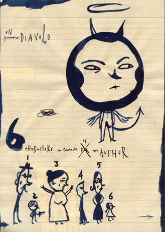
political satire much like editorial work is steeped in abstractions and visual metaphor, and has to be relevant with a quick turn over often working on a weekly basis. 
This artwork is based off Steve bells work, when I first saw his work I prominently saw that it had a cartoonish element to it so i wanted to include this "warner brothers"-esque exaggerated posture along with bells signature condom headed caricature of Cameron. 
[1] a fan of cartoons from an early age....Bell recalled that it "had a superb cartoonist called [Leslie] Illingworth who was a brilliant draughtsman...and Trog [Wally Fawkes], who was big influence on me"
This contrasting with the comparatively realistic dead horse emphasising the visual metaphor.

 
Peter Brookes was the next artist I looked at, his depiction of Cameron is fairly tame in comparason to most current artists. Brookes describes his take on Cameron with:
[2] "Cameron glows privilege...The nose is patrician, almost Roman, and the mouth small. His hair, if not an Eton crop, is certainly very public school - it’s got bounce...There is a definite quiff" 
Brookes works with dip pens usually, then adding colour with ink and water colour, I followed suit with his techniques.  
Scarfe has a particularly distinct style, I wanted to immediately capture his visceral style. he's most known for his extreme takes on caricature, almost transforming them into anthropomorphic creatures or things, well known his depictions of Thatcher.
[3] "I could always draw her as something acerbic [and] cutting, like an axe or a knife...It's great fun transmogrifying [politicians] into other objects"
I tried to emulate his current drawings of Cameron with his ink based work, taking advantage of his directional backgrounds, and use of splattering throughout the work. 
George Grosz was the last artist that I looked at, I found him to be very different than the other artists I looked at being that he was a German dadaist in ww2

 [4]  Beauty thee will I praise, 1927
Grosz would most commonly used pen to then on be printed through photo-lithograph, largely line based style with textural marks as sparse shading, I tried to recreate his process with a ballpoint pen. 

references: 
[1] British Cartoon Archive.
[2] British Cartoon Archive.
[3] Kinghorn. k.
[4] Grosz. G.

Bibliography:
 British Cartoon Archive. [Date unknown]. Steve Bell. [online]. [Accessed 6th December]. Available from: https://www.cartoons.ac.uk/artists/stevebell/biography
British Cartoon Archive. [Date unknown]. Peter Brookes. [online]. [Accessed 6th December]. Available from: https://www.cartoons.ac.uk/artists/peterbrookes/biography
Grosz. G. 1927. Beauty thee will I praise. [online]. [Accessed 6th December]. Available from: http://www.awwwards.com/gallery/1223/george-grosz/ 
Kinghorn. k. 2015. Gerald Scarfe's controversial Margaret Thatcher cartoons on show.
[Accessed 6th December]. Available from: http://www.bbc.co.uk/news/uk-england-tees-31711778
 

Friday, 4 December 2015

concept art is needed for many kinds of projects, this will focus mainly on visual arts such as books, film and gaming. Steven cooper, an artist that has produced work for television and gaming has had a talk with us and informed a lot of this work.

 
Steven cooper took large amounts of inspiration in his early years from surrealist techniques. This technique is Soufflage, Cooper would spatter and blow ink around to create a random shape, then work into this shape, usually with a gel pen so that the ink would bleed into the wet paper.
I found that my ballpoints bled better with the ink in this process, however I felt I had to work back into it with a crisper edge to define the shape of a windswept tree.
 
H. G Geigers use of surrealist imagery often engaging in erotic-grotesque imagery and bio-mechanachalism is provocative and can be used to great effect to communicate a characters symbology.
I took inspiration from several of Geigers works to create this character.
[1] danzig how the gods kill cover
https://vice-images.vice.com/images/content-images/2015/05/22/blondies-chris-stein-recalls-working-with-hr-giger-309-body-image-1432301499.jpg?resize=*:*&output-quality=75 
[2] Debbie Harry - Kookoo Cover
 Giger Tarot Cards 
[3] The wheel of fortune  
I Created this piece with a ink sketch first, then moving onto a digital platform, Emulating the smooth airbrushed tones of Geiger work was hard to control however I feel that I have given a recognisable feel to the piece by using his trademarks.

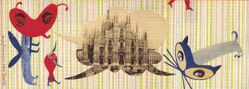
frottage is a surrealist technique where one would take rubbings of a textured surface and then arrange them to create a work, most famously used and created by Max Enst 
Max Ernst (1891–1976)  Le start du châtaigner (The Start of the Chestnut Tree)  1925. Frottage w... 
[4] Le start du châtaigner (The Start of the Chestnut Tree)
I made this piece in a digital format since i found that the tones blured together too much when they where the same tone. Manipulating the levels illustrated the impression of depth better.
 this work was made through Decalcomania, a process where paint is spread thickly on paper and then a sheet of acetate or tin foil is pressed on-top of it through capillary action paint is spread out and when peeled off it becomes textured giving an extra level of detail. I found that my first prints with this process did not come up with many interesting shapes, having to do a second print from my original print to bring out the wettest parts of the print. I later added fine liner into it, describing the figures I saw better.
 
References: 
[1] Giger. H. R.
[2] Giger. H. R.
[3] Giger. H. R.
[4]Kustanczy. C

bibliography:
Kustanczy. C. 2013. Le start du châtaigner. [online]. [accessed 6th December]. available from:  http://www.digitaljournal.com/image/141858
Giger. H. R. 1992. Danzig III: How the Gods Kill. [online]. [accessed 6th December]. available from: https://s-media-cache-ak0.pinimg.com/736x/83/4c/29/834c298b258a4d09abbc942c854bab22.jpg
Giger. H. R. 1992. Kookoo. [online]. [accessed 6th December]. available from: https://en.wikipedia.org/wiki/KooKoo#/media/File:Debbie_Harry_-_Koo_Koo.jpg
 Giger. H. R. 1992. The wheel of fortune. [online]. [accessed 6th December]. available from:https://s-media-cache-ak0.pinimg.com/736x/ea/b4/63/eab463850e6a1d19b3393f484e6c5d2b.jpg

Thursday, 3 December 2015

This editorial illustration project will be looking at several artists throughout the medium, ultimately a piece of work in response to an article that aims to translate and reflect on the subject matter while also being engaging to the audience.  


Work in response to:  Phones need 'bed mode' to protect sleep if gif is not working refer to here

With the increasing turn to the internet for news and magazine articles companies are starting to harness different types of digital media, the one that is most emergent is the use of gifs.
Gifs can give more life into a new dimension
[1] "The trick with animated GIFs is that the final image needs to work as both a still image in print that can stand on its own, and also as an animation online that adds to the meaning or emotional resonance of the image and the story."
 [1] Rebecca mock for the New York Times


work in response to: 5 reasons why your next light bulb should be a smart bulb
This piece was based off Heinz Edelmann editorial work who was most prevalent in the 1960's.
[2] ‘Andromedar SR1’ Book Illustrations
Edelmann used the emerging psychedelic culture of the 60's to coin a distinct style based around colour and pattern, described as [3] "stylized, soothingly fluid, neo-Art Nouveau" 
relating Edelmanns work to mine them both using consistantly thin line and art saturated colours with slight unevenness in overall tone.


[4] "Her understanding and intelligent assimilation of art and design is sensitive and focused as are her compositions, where extraneous details are dispensed with. The ability to visually articulate often abstract values, has not been lost on corporate clients"
 Aude Van ryns ink works where ones i found the most enjoyable my image and the below both making used of ink layering and fine patterning within the trees, she seems to prefer a navy blue ink when working in this medium.

http://www.heartagency.com/store/images/1388/main/van%20ryn%20bio%20image%202.jpg 
[4] heart agency profile picture

work in response to:  Home, sweet home: Mountain Housing Opportunities celebrates The Villas at Fallen Spruce Apartments
Eric Frasers art is known for a bold, line based black and white style, having worked in the radio times he dealt with sensitive concepts like life, death and war with subtlety.
http://www.phaeton.ie/images/Fraser7.gif
[5] Unknown Eric Fraser image
I tried to recreate his prints with ink and white out, however I feel that this was not the most successful experiment as I could not fully recreate the clean lines that Fraser creates.

 Referances:

[1] Wired.
[2]Sci-fi-o-Rama.
[3] New York Times, The.
[4] Heartagency.
[5] Fraser. E.

Bibliography:

 Fraser. E. [date unknown]. [title unknown].[online] [Accessed 5th December] available from: http://www.phaeton.ie/images/Fraser7.gif 
Heartagency. [Date unknown]. Aude Van Ryn. [online] [Accessed 4th December] available from: http://www.heartagency.com/artist/AudeVanRyn/biog
New York Times, The. 2009. Heinz Edelmann, ‘Yellow Submarine’ Artist, Dies at 75. [online] [Accessed 4th December] available from:  http://www.nytimes.com/2009/07/23/arts/design/23edelmann.html
Sci-fi-o-Rama. 2013. Electrical Banana – Masters of Psychedelic Art. [online] [Accessed 4th December] available from: http://www.sci-fi-o-rama.com/2013/04/07/electrical-banana-masters-of-psychedelic-art/
Wired. 2013. 10 Awesomely Tasteful Animated GIFs. [online] [Accessed 4th December] available from: http://www.wired.com/2013/09/the-rise-of-subtle-tasteful-and-commissioned-animated-gif-illustrations/ 

Wednesday, 2 December 2015


Sara Fanelli is a Childrens illustrator who works largely with collage taking influence in surrealist methodology often linked to German or Czech surrealism. [1]
"I look at photography and film - Bauhaus, Russian constructivist, surrealist, 1960's art - and i also find inspiration from popular art and primitive art"[2]
Her influences such as surrealism can be seen in her simplistic, yet unique character design, with her mash of patterns, textures, words and photography.
 
this was my first experiment trying to emulate Sara Fanellis work,taking influence from the onion's great escape by working outside the intended size akin to the books mix and match nature having a smaller book within it, creating it's own narrative when separated from the book.
 [3] The onion's great escape 
This piece is a collage using textured paper and news print alongside vintage photography.
The second Experiment was based off Fanelli's experiment "think of an elephant"
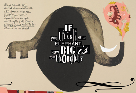
http://www.phaidon.com/resource/05-think-of-an-elephant.jpg 
[4] "think of an elephant"
She describes her work as [4]"an organic process" which is apparent in her loose and contemporary style, using watercolour to create a base shape and then acrylic and photography to give definition to it's features, using cut out letters to annotate it.
I feel that this experiment turned out the best, looking at how Fanelli creates characters, I used digital process for this giving me more free reign over the textures and materials I have used. 
This piece looked at how Fanelli created collaged characters.
[5] royal mail stamp
 
[6] Ron Arad Milan show invite
Body shapes are more often just one shape containing a pattern or texture, I liked the heart or bean head shape she had used in the Milan show invite as it extenuated the nose. using red and blue as my main colours with a light yellow to dissipate any harshness created. Adding a graphical but mild background to contrast with the organic shapes in the foreground.
This ink work was based of Fanellis sketchbook pages, she would often work in ink on lined, toned paper and black and blue ink. Fanelli often incorporates quotes from surrealist artists in her sketches as well.

[7] [8] sketchbook pages 
using brown paper, blue ink and using a quote from k.j.bishop i took inspiration from these pages using the same kind of methods fanelli would using only brush right on the page without any fore-planning.  
[9] "It's bolder than a pen and I like to allow the mark itself to suggest the direction the drawing should take; but you have to draw with knowledge - it's only when you have control over the drawing that you can let it have that freedom."


References:

[1] The Guardian.
[2] Heller, S.
[3] Fanelli, S.
[4] Phaidon.
[5] Fanelli. S.
[6] Fanelli. S.
[7] Fanelli. S.
[8] Fanelli. S.
[9]Carey. J.

Bibliography:

Carey. J. 2004.  Dynamic doodles. [online]. [accessed 4th December]available from: http://www.theguardian.com/books/2004/apr/17/featuresreviews.guardianreview8
Fanelli, S. 2012. The onion's great escape. England. Phaidon Press.
Fanelli. S. [Date unknown]. royal mail stamp. [online]. [accessed 4th December] available from: http://www.sarafanelli.com/docs/portfolio/10.html 
Fanelli. S. [Date unknown]. Ron Arad Milan show invite. [online]. [accessed 4th December] available from: http://www.sarafanelli.com/docs/portfolio/17b.html
Fanelli. S. [Date unknown]. Sketchbook pages. [online]. [accessed 4th December] available from: http://www.sarafanelli.com/docs/portfolio/18b.html
Fanelli. S. [Date unknown]. Sketchbook pages. [online]. [accessed 4th December] available from:http://www.sarafanelli.com/docs/portfolio/18a.html
The Guardian. 2011. Sara Fanelli - a life in pictures. [online]. [Accessed 2nd December 2015]. Available from: http://www.theguardian.com/childrens-books-site/gallery/2011/mar/31/childrens-books-7-and-under
 Phaidon. 2012. The thought-provoking illustrations of Sara Fanelli. [online]. [accessed 4th december]. available from: http://uk.phaidon.com/agenda/design/articles/2012/april/02/the-thought-provoking-illustrations-of-sara-fanelli/

Tuesday, 1 December 2015

Chris Ware

Chris Ware is a sequential artist with a refined and controlled style comparable to graphic arts. Drawing with bolder line depth and flat colour, his approach to art is very different than mine as I prefer soft-cell shading more delicate and complex line work, however I found that the project was good for me, ultimately reigning in my style and simplifying the page down.


One returning element in Wares work that appealed to me most was the manipulation of time within a sequence. Using queues from the surrounding environment to squish or stretch the amount of time shown adding atmosphere and breathing time to the piece.
[1] Jimmy Corrigan: The Smartest Kid on Earth
we can see from the excerpt from Jimmy Corrigan how ware has created a sense of time passing with simple environmental changes such as rain drops falling from the wires and the street lights turning on. this can be related back to my work as I display the sun setting and lights becoming more apparent in my first work displaying how the day has passed, while in my second work having the steam of a coffee cup rise while nothing else has moved in the frame, displaying the works slowness.

Ware leans towards a natural and muted pallet within his work using primary colours to highlight key moments and is often used in the design of the main character.
[2] The Last Saturday
in the first few pages of the last Saturday we are introduced to our main character that immediately stands out from the background his clothing made up of tints, tones and a small amount of saturated blue while backgrounds are largely made from muted tones, although there is not much difference of line depth from foreground to background these colour choices make figures become the focus of the panel. Relating this method to my experiment we can see that the main focus is the characters face with its saturated green eyes and light blue face mask.


Ware sometimes uses a highly graphical non linear sequence usually linking back to a main image. using panels of different sizes and shapes, often using scattering seemingly unrelated sequences throughout the page often linking back to a central figure in the sequence. 
"your working in discreet units of pages which are sort of analogous to the way that we divide and break up our own memories and where we choose to start and stop them, one of the reasons why I try, at least to make the books look as nice as I can...is to try and contradict what's going on within the characters minds" [3]
This breaking up of organized sequence that ware describes as going from A to B leaves readers multiple ways of starting the page there being no single correct way to start.
 
Chris Ware draws influence from 40s-50's media, this is largely seen in his early work Quimby the mouse, as the titular character has been related to Krazy Kats, Ignatz Mouse [4] both in personality and stature influenced by the simple shapes and rubber hose anatomy. However we can also see the influence of commercials of that time period, making non linear sequences in Jimmy Corrigan.
  
[1] Jimmy Corrigan
Using Wares methods of adapting and re purposing older works I have taken the 1957 film "reform school girl" and used it's composition to create a page.
 
[5] Reform school girl film poster

References:
[1] Ware, C.
[2] The Guardian.
[3] FearNoArtChicago
[4]
[5] Reform School Girl.

Bibliography:
A Mouse; A House; A Mystery.[Accessed 2nd December 2015] [Available from:] http://content.time.com/time/arts/article/0,8599,477842,00.html
FearNoArtChicago (2012) Graphic Novelist, Chris Ware. [Accessed: 2nd December 2015] [Available from:]https://www.youtube.com/watch?v=W4MOYCvgEmw 
The Guardian. (2015). The Last Saturday, by Chris Ware. [online]. [Accessed 2nd december 2015]. [Available from:] http://www.theguardian.com/books/ng-interactive/2014/sep/13/-sp-chris-ware-the-last-saturday-graphic-novel
Reform School Girl. (1957). [poster].[Accessed 2nd December] [Available from:] https://en.wikipedia.org/wiki/Reform_School_Girl 
Ware, C. (2000). Jimmy Corrigan, the Smartest Kid on Earth. Chicago. pantheon books.